


监控页也能这么美?Uptime Kuma 界面美化全攻略
本文最后更新于 2025-08-26,文章内容可能已经过时。
🌟 前言
Uptime Kuma 是一款轻量好用的监控工具,但默认界面略显单调。本文分享几种简洁美观的 CSS 美化方案,通过毛玻璃、呼吸灯动画和动态背景,让监控页面更具科技感与视觉吸引力。无需修改代码,只需一键粘贴自定义 CSS,即可轻松提升你的状态页颜值。
⚙️ 配置说明
进入 Uptime Kuma 状态页面;
点击 “编辑状态页面”;
在 “自定义 CSS” 框中粘贴任一方案的 CSS 代码;
保存即可生效
💡 所有样式均无需修改源码,纯前端实现,安全无副作用。
🎨 方案一:渐变炫彩风
🖼️ 效果预览
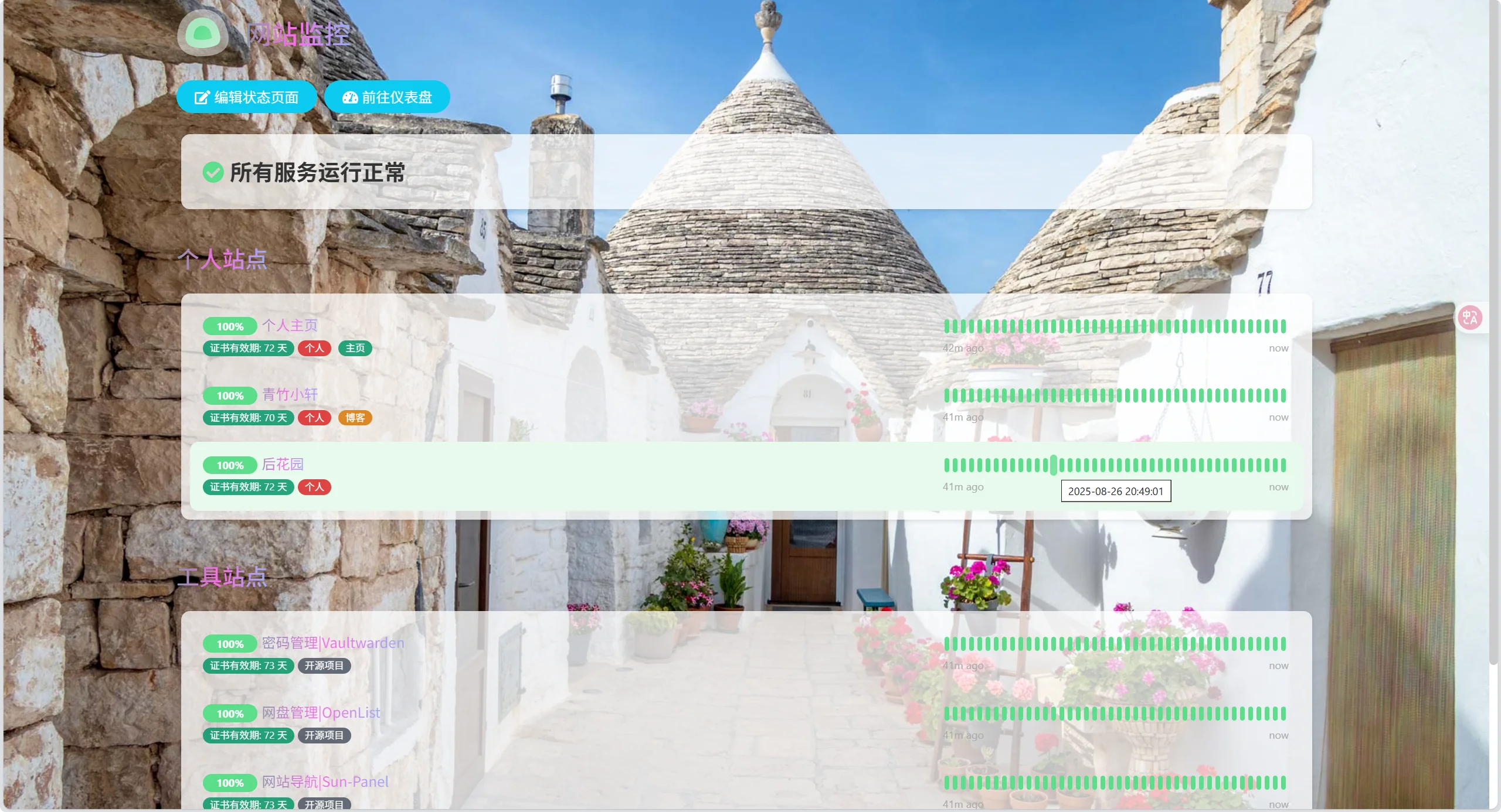
✨ 核心特性
动态渐变文字:关键标题与状态文本采用多色线性渐变 +
background-clip: text实现炫彩流动动画,科技感十足。自定义字体加载:引入专属中文字体
1666963922,提升整体排版美感与个性化。全屏动态背景:通过外部 API 自动获取 Bing 每日壁纸作为背景,固定定位、自适应缩放,打造沉浸式视觉体验。
透明毛玻璃卡片:在亮/暗主题下分别使用
rgba(255,255,255,0.75)与rgba(0,0,0,0.65)背景,配合阴影实现轻盈通透感。
🧩 CSS代码
/* 自定义字体定义 */
@font-face {
    font-family: '1666963922';
    src: url('https://jsd.cdn.zzko.cn/gh/54ayao/ACG@main/static/fonts/1666963922.woff') format('woff');
    font-weight: normal;
    font-style: normal;
}

/* 全局样式 */
body {
    font-family: '1666963922', sans-serif; /* 使用自定义字体 */
    color: #333;
    margin: 0;
    padding: 0;
    background-image: url('https://ipgeo-bingpic.hf.space'); /* 自适应背景图片API */
    background-attachment: fixed;
    background-size: cover;
    background-position: center center;
    background-repeat: no-repeat;
}

/* 导航栏链接悬停样式 */
.navbar a:hover {
    text-decoration: underline;
}

/* 卡片样式 */
.card {
    background-color: #fff;
    border-radius: 5px;
    box-shadow: 0 2px 5px rgba(0, 0, 0, 0.1);
    margin-bottom: 20px;
    padding: 20px;
}

/* 卡片标题样式 */
.card-title {
    font-size: 18px;
    font-weight: bold;
    margin-bottom: 10px;
}

/* 在明亮主题下,应用不同的背景色及75%透明度 */
.shadow-box {
    background-color: rgba(255, 255, 255, 0.75);
    padding: 10px;
    margin: 5px;
    border-radius: 10px;
    box-shadow: 0 2px 5px rgba(0, 0, 0, 0.1);
  text-decoration: none;

}
/* 在暗色主题下,应用不同的背景色及65%透明度 */
.dark .shadow-box:not(.alert) {
    background-color: rgba(0, 0, 0, 0.65);
     padding: 20px;
    margin: 10px;
    border-radius: 5px;
    box-shadow: 0 2px 5px rgba(0, 0, 0, 0.1);
}
/* 侧边栏样式 */
.sidebar {
    background-color: rgba(255, 255, 255, 0.9);
    padding: 20px;
    margin: 10px;
    border-radius: 5px;
    box-shadow: 0 2px 5px rgba(0, 0, 0, 0.1);
}

/* 特定元素和类的样式 */
span[data-v-7d4a7f28],
.item-name,
div.description[data-v-7d4a7f28][data-v-b8247e57][contenteditable="true"],
div[data-v-7d4a7f28][data-v-b8247e57].alert-heading.p-2,
.refresh-info > div,
.alert-heading.p-2 > div,
.alert-heading.p-2 > p,
.alert-heading.p-2 > h1 {
    background-image: linear-gradient(90deg, #07c160, #fb6bea 25%, #3aedff 50%, #fb6bea 75%, #28d079);
    font-family: '1666963922', sans-serif;
    -webkit-text-fill-color: transparent;
    -webkit-background-clip: text;
    background-size: 400% 100%;
    animation: wzw 10s linear infinite;
}

/* 动画关键帧定义 */
@keyframes wzw {
    0% {
        background-position: 0% 50%;
    }
    50% {
        background-position: 100% 50%;
    }
    100% {
        background-position: 0% 50%;
    }
}
  #app {
font-family: '1666963922', BlinkMacSystemFont, 'segoe ui', Roboto, 'helvetica neue', Arial, 'noto sans', sans-serif, 'apple color emoji', 'segoe ui emoji', 'segoe ui symbol', 'noto color emoji' !important;
}
🎨 方案二:横向卡片风
适合需要监控大量服务、注重信息密度与操作效率的用户,兼顾美观与实用性。
🖼️ 效果预览
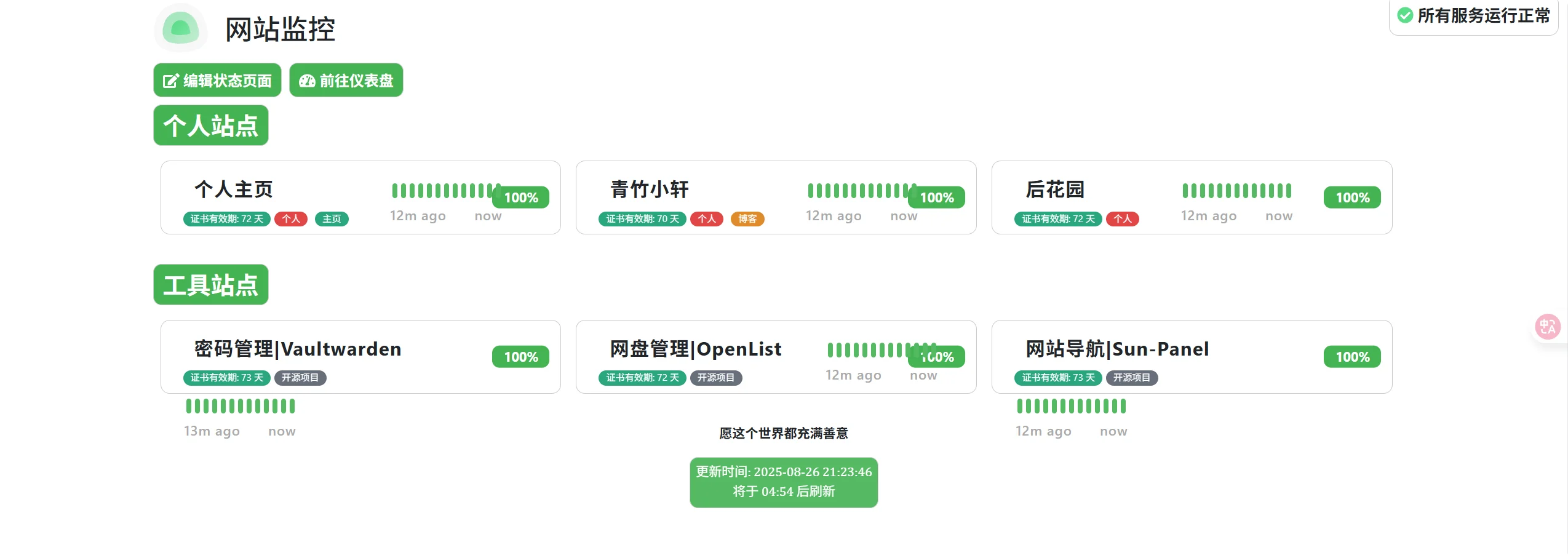
✨ 核心特性
响应式横向布局:采用 Flex + Grid 混合布局,卡片宽度随屏幕尺寸自动调整(1→2→3→4 列),适配桌面至移动端。
紧凑高效排版:降低卡片高度至
80px,优化信息密度,单屏可展示更多监控项目,提升管理效率。动效导航按钮:链接左侧添加绿色竖条,悬停时横向扩展填充背景,配合颜色反转,交互反馈清晰。
统一色彩体系:基于
--bs-primary-rgb定义主色调(绿色),按钮、徽章等元素风格统一,专业感强。隐藏滚动条:移动端隐藏浏览器默认滚动条,界面更整洁。
🧩 CSS代码
/* ==============================
   1. 基础元素样式
============================== */
/* 项目名称样式 */
.item-name[data-v-f71ca08e] {
    font-weight: 700;
    padding-left: 10px;
    padding-right: 6px;
    margin: 2px;
    margin-right: auto;
}

/* 链接样式及动画效果 */
a {
    text-decoration: none;
    position: relative;
    padding-left: 12px;
    z-index: 1;
    display: inline-block;
    transition: all cubic-bezier(0.4, 0, 0.2, 1) 0.3s;
}

a:not(.btn-info)::before {
    content: '';
    position: absolute;
    left: 0;
    top: 46%;
    transform: translateY(-50%);
    width: 5px;
    height: 25px;
    margin: 2px;
    background-color: #55ba63;
    transition: all cubic-bezier(0.4, 0, 0.2, 1) 0.3s;
    border-radius: 3px;
    z-index: -1;
}

/* Hover效果 */
/* 白天模式 */
a:hover,
.p-2:hover {
    color: #fff !important;
}

/* 夜间模式 */
.dark a:hover,
.dark .p-2:hover {
    color: #000 !important;
}

/* 内边距样式 */
.p-2 {
    padding-left: 0px;
    padding-right: 10px;
    font-weight: 700;
    margin: 6px;
}

/* 链接悬停动画 */
a:hover::before {
    width: 100%;
    left: 0;
    border-radius: 6px;
}

/* ==============================
   2. 布局系统变量
============================== */
:root {
    --bs-primary-rgb: 67, 179, 82;
    --item-width: 280px;
    /* 项目宽度 */
    --item-height: 80px;
    /* 降低高度适应横向布局 */
    --grid-spacing: 1rem;
    /* 间距 */
    --item-padding: 0.75rem;
    /* 内边距 */
}

/* ==============================
   3. 响应式设计
============================== */
@media (max-width: 768px) {
    .item {
        width: 100%;
        margin-right: 0;
    }

    :root {
        --item-height: 70px;
    }

    .container {
        padding: 0 0.5rem;
    }
}

@media (min-width: 769px) and (max-width: 1200px) {
    .item {
        width: calc(50% - var(--grid-spacing));
    }
}

@media (min-width: 1201px) {
    .item {
        width: calc(33.333% - var(--grid-spacing));
    }
}

@media (min-width: 1600px) {
    .item {
        width: calc(25% - var(--grid-spacing));
    }

    .item-name {
        font-size: 1.3em;
        font-weight: 700;
        letter-spacing: 0.8px;
    }

    .badge,
    .tag-text[data-v-24636654] {
        font-size: 0.9em;
    }

    .wrap>.d-flex {
        font-size: 0.9em;
        font-weight: 500;
        letter-spacing: 0.8px;
    }
}

/* ==============================
   4. 布局组件
============================== */
/* 容器设置 */
.container {
    max-width: 1400px;
    margin: 0 auto;
    padding: 0 1rem;
}

/* 监控列表布局 */
.monitor-list {
    display: flex !important;
    flex-wrap: wrap !important;
    gap: var(--grid-spacing) !important;
    justify-content: flex-start;
    width: 100%;
    padding: 0.5rem;
}

/* ==============================
   5. 卡片组件
============================== */
/* 卡片基础样式 */
.item {
    position: relative;
    width: calc(33.333% - var(--grid-spacing));
    min-width: 280px;
    height: var(--item-height);
    padding: var(--item-padding) !important;
    border: 1px solid #ccc;
    border-radius: 8px;
    background: var(--card-bg, #fff);
    margin-bottom: var(--grid-spacing);

    /* Flexbox布局 */
    display: flex;
    flex-direction: row;
    align-items: center;
    gap: 1rem;

    /* 动画效果 */
    transition: transform 0.2s ease, box-shadow 0.2s ease;
}

.item:hover {
    transform: translateY(-2px);
    box-shadow: 0 4px 12px rgba(0, 0, 0, 0.1);
}

.item>.row {
    flex-direction: row;
    width: 100%;
    margin: 0;
    align-items: center;
}

.row>div {
    width: auto;
    margin-right: 1rem;
}

/* 状态条样式 */
.hp-bar-big .beat[data-v-636dc6a9] {
    background-color: #55ba63;
}

.hp-bar-big {
    min-width: 120px;
}

/* ==============================
   6. 徽章组件
============================== */
/* 徽章定位 */
body:not(.mobile) .badge,
body.mobile .badge {
    position: absolute;
    top: 50%;
    right: var(--item-padding);
    transform: translateY(-50%);
}

/* ==============================
   7. 标题与按钮
============================== */
/* 分组标题样式 */
.group-title span[data-v-f71ca08e] {
    display: inline-block;
    min-width: 70px;
    margin: 0 auto;
    text-align: center;
}

/* 标题和信息按钮样式 */
h2,
.h2,
.btn-info {
    margin-bottom: 0rem;
    font-weight: 600;
    color: white;
    border: 1px solid #ccc;
    --bs-bg-opacity: 1;
    background-color: rgba(var(--bs-primary-rgb), var(--bs-bg-opacity));
    border-radius: 9px;
    padding: 6px 10px;
    display: inline-block;
    text-align: center;
    min-width: 8%;
}

/* ==============================
   8. 主题设置
============================== */
/* 深色主题样式覆盖 */
.dark h2,
.dark .h2,
.dark .btn-info,
.dark .refresh-info[data-v-b8247e57] {
    color: #000000;
}

/* 状态指示器 */
.overall-status {
    border: 1px solid #ccc;
    border-radius: 9px;
    position: absolute;
    top: 10px;
    right: 10px;
    padding: 0.5rem !important;
}

.overall-status[data-v-b8247e57] {
    font-weight: 700;
    font-size: 18px;
}

/* 维护状态背景色 */
.bg-maintenance {
    background-color: #4962bd !important;
}

/* 刷新组件样式 */
.refresh-info[data-v-b8247e57] {
    font-family: math;
    opacity: 0.9;
    color: #ffffff;
    border: 1px solid #ccc;
    --bs-bg-opacity: 1;
    background-color: rgba(var(--bs-primary-rgb), var(--bs-bg-opacity));
    border-radius: 9px;
    padding: 6px 6px;
    display: inline-block;
    text-align: center;
    min-width: 4%;
}

/* UI元素样式 */
.rounded-pill {
    border-radius: 0.5rem !important;
}

.shadow-box {
    box-shadow: 0 15px 70px rgba(0, 0, 0, 0);
    padding: 0px;
    border-radius: 10px;
}

/* 间距调整 */
.p-2 {
    padding: 0rem !important;
}

.mb-4,
.mb-5 {
    margin-bottom: 0.5rem !important;
}

.mt-4 {
    margin-top: 0.5rem !important;
}

.mt-5 {
    margin-top: 0 !important;
}

/* 工具样式 */
::-webkit-scrollbar {
    display: none;
}
🎨 方案三:毛玻璃拟态风(推荐)
🖼️ 效果预览
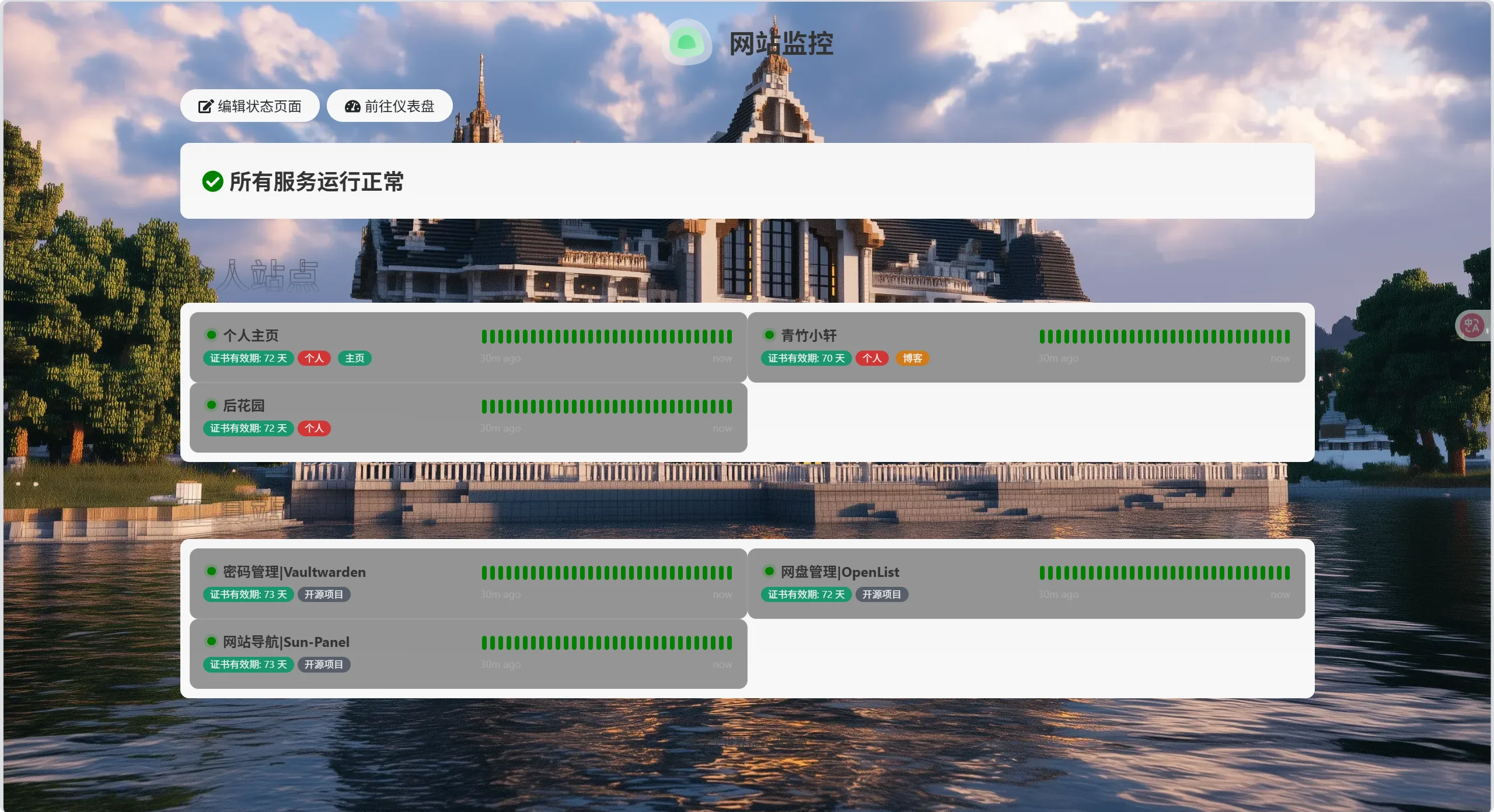
✨ 核心特性
毛玻璃特效(Glassmorphism):卡片与按钮启用
backdrop-filter: blur(8px),叠加半透明背景,营造现代拟态视觉。动态呼吸灯动画:状态指示灯使用
::before/::after伪元素实现呼吸动画,模拟真实设备心跳,增强动态感知。双模式自适应:通过
:root与.dark变量定义亮/暗主题配色,完美支持 Uptime Kuma 主题切换。背景图融合设计:使用高质量动态背景图(如 Minecraft 风格壁纸),与毛玻璃效果叠加,层次丰富。
拟态标题设计:组标题采用
-webkit-text-stroke与mask实现描边镂空效果,艺术感突出。极简去噪:隐藏“最后更新时间”等次要信息,聚焦核心监控数据。
🧩 CSS代码
:root {
    --bs-white: #fff;
    --bs-dark: #212529;
    --bs-green: #008000;
    --bs-danger: #dc3545;
    --bs-body-bg: #f6f7f9;
    --bs-blue: #0d6efd;
    --bg-linear-gradient: linear-gradient(180deg, #f6f6f6, #f8f8f8);
    --border-solid-main: 2px solid var(--bs-white);
    --border-solid-small: 1px solid var(--bs-white);
    --shadow-inset-box: inset -4px -4px 12px #f1f1f1, inset 4px 4px 12px #e2e2e2;
}

.dark {
    --bs-white: #2d2d2d;
    --bs-dark: #e9ecef;
    --bs-green: #00c800;
    --bs-danger: #dc3545;
    --bs-body-bg: #222222;
    --bg-linear-gradient: linear-gradient(180deg, #242424, #222222);
    --border-solid-main: 2px solid rgba(45, 45, 45, 0.8);
    --border-solid-small: 1px solid rgba(45, 45, 45, 0.6);
    --shadow-inset-box: inset -4px -4px 12px #0d0d0d, inset 4px 4px 12px #1a1a1a;
}

body {
    background-color: var(--bs-body-bg) !important;
}

/* 全局样式 */
body {
    font-family: 'CustomFont', sans-serif;
    color: #333;
    margin: 0;
    padding: 0;
    background-image: url('https://api.fis.ink/mc');
    background-attachment: fixed;
    background-size: cover;
    background-position: center center;
    background-repeat: no-repeat;
}

/* LOGO标题样式 */
.title-flex {
    font-weight: bold;
    justify-content: center;
}

/* 按钮 */
.btn-info {
    color: var(--bs-dark);
    background-image: var(--bg-linear-gradient);
    border: var(--border-solid-main);
    background-color: rgba(255, 255, 255, 0.2) !important;
    backdrop-filter: blur(6px);
    -webkit-backdrop-filter: blur(6px);
    border: 1px solid rgba(255, 255, 255, 0.3);
    box-shadow: none !important;
}

.btn-info:hover {
    color: var(--bs-dark);
    background-color: transparent;
    border-color: unset;
    box-shadow: none !important;
}

/* 服务组标题 */
.group-title {
    font-size: 2.5rem;
    font-weight: 700;
    opacity: .5;
    -webkit-mask: linear-gradient(var(--bs-white) 50%, transparent);
    mask: linear-gradient(var(--bs-white) 50%, transparent);
    text-stroke: 1px var(--bs-dark);
    -webkit-text-stroke: 1px var(--bs-dark);
    -webkit-text-fill-color: transparent;
}

/* 服务项目列表样式 */
.monitor-list .monitor-list {
    min-height: 45px;
    display: grid;
    grid-template-columns: repeat(2, 1fr);
}

.monitor-list .item .info {
    display: flex;
    flex-wrap: wrap;
    align-items: center;
}

.info1::before,
.info1::after {
    content: "";
    display: inline-block;
    width: 10px;
    height: 10px;
    background-color: var(--bs-white);
    margin: 0.5rem 0;
    border-radius: 50%;
    animation: breath 1.5s ease-in-out infinite;
}

.info1::after {
    animation-delay: 0.75s;
}

.info .bg-danger+.item-name {
    color: var(--bs-red);
}

.shadow-box {
    margin-top: 0 !important;
    background-image: var(--bg-linear-gradient);
    box-shadow: none !important;
}

div[data-v-f71ca08e].mb-5:hover .group-title {
    -webkit-text-fill-color: var(--bs-dark);
}

.monitor-list .item {
    box-shadow: none !important;
}

.monitor-list .item:hover {
    background-color: rgba(0, 0, 0, 0.5) !important;
    box-shadow: none !important;
}

.dark .monitor-list .item:hover {
    background-color: var(--bs-body-bg);
    box-shadow: none !important;
}

/* 服务项目列表标题样式 */
.item-name {
    font-weight: bold;
}

a {
    text-decoration: none !important;
}

a.item-name:hover {
    color: var(--bs-blue) !important;
}

.overall-status .ok {
    color: var(--bs-green) !important;
}

.hp-bar-big .beat[data-v-636dc6a9] {
    background-color: var(--bs-green);
}

.item .row {
    justify-content: space-between;
}

.info .badge.rounded-pill.bg-primary {
    --bg: var(--bs-green);
}

.info .badge.rounded-pill.bg-danger {
    --bg: var(--bs-danger);
}

.info .badge.rounded-pill {
    position: relative;
    display: flex;
    min-width: auto;
    width: 1rem;
    margin-left: 0.1rem;
    font-size: 0;
    justify-content: center;
    align-items: center;
    background-color: transparent !important;
}

.info .badge.rounded-pill::before {
    position: absolute;
    content: "";
    width: 1rem;
    height: 1rem;
    border-radius: 50%;
    background-color: var(--bg);
    animation: breath 1.1s ease-in-out infinite;
}

.info .badge.rounded-pill::after {
    content: "";
    width: 0.6rem;
    height: 0.6rem;
    border-radius: 50%;
    background-color: var(--bg);
}

@keyframes breath {

    0%,
    100% {
        transform: scale(1);
        opacity: 0.2;
    }

    50% {
        transform: scale(1.2);
        opacity: 0;
    }
}

/* 隐藏更新时间 */
.refresh-info.mb-2 {
    display: none;
}

/* 公共样式优化 */
.col-md-4 {
    width: 50%;
}

.col-md-8 {
    max-width: 50%;
    display: flex;
    flex-wrap: wrap;
    flex-direction: column;
}

.mb-5 {
    margin-bottom: 2rem !important;
}

/* 底部样式 */
footer[data-v-b8247e57] {
    margin: 1.5rem 0 !important;
}

footer p {
    margin: 0 !important;
}

/* 适配手机 */
@media screen and (max-width: 768px) {
    .monitor-list .monitor-list {
        grid-template-columns: repeat(1, 1fr);
    }

    .group-title {
        font-size: 2rem;
    }
}

/* 全局半透明背景卡片 */
.shadow-box,
.monitor-list .item {
    background-color: rgba(0, 0, 0, 0.4) !important;
    backdrop-filter: blur(8px);
    -webkit-backdrop-filter: blur(8px);
    border: 1px solid rgba(255, 255, 255, 0.1);
}

/* 暗色模式下卡片透明度调低 */
.dark .shadow-box,
.dark .monitor-list .item,
.dark .btn-info {
    background-color: rgba(34, 34, 34, 0.3) !important;
    border: 1px solid rgba(255, 255, 255, 0.1);
}

/* 标题透明度柔和 */
.group-title {
    opacity: 0.5;
}
🎨 方案四:极简拟态风
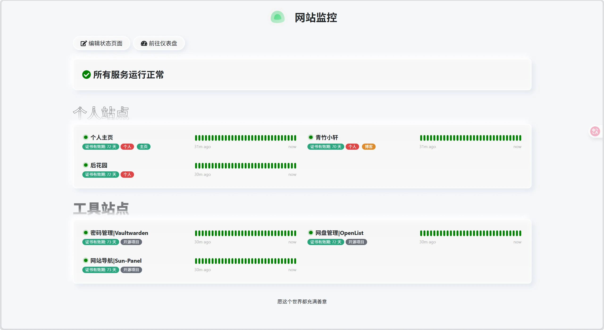
采用了类拟态化设计风格,支持暗色/亮色模式自适应,优化了状态卡片的层级结构,显著提升了数据的可读性。虽然CSS主题风格与博客保持一致,但也完全可以独立使用,整体效果简洁美观!
适合偏好极简主义、追求细节质感的用户,风格低调但富有设计感,适合嵌入博客或个人主页。
🖼️ 效果预览
✨ 核心特性
新拟态(Neumorphism)风格:通过精细控制内外阴影(
inset与outset)打造浮雕式按钮与卡片,界面柔和立体。双模式深度适配:亮/暗主题均重新定义阴影、边框与渐变,确保在任何模式下都有出色视觉一致性。
呼吸状态指示器:将传统静态百分比 badge 替换为圆形呼吸灯动画,直观反映服务“心跳”状态。
层级清晰的阴影系统:主卡片使用
--shadow-box-main,按钮使用--shadow-box-small,视觉层次分明。优雅字体与排版:标题采用描边镂空设计,配合高透明度,营造轻盈高级感。
响应式优化:手机端自动切换为单列布局,字号与间距适配小屏阅读。
🧩 CSS代码
:root {
    --bs-white: #fff;
    --bs-dark: #212529;
    --bs-green: #008000;
    --bs-danger: #dc3545;
    --bs-body-bg: #f6f7f9;
    --bs-blue: #0d6efd;
    --bg-linear-gradient: linear-gradient(180deg, #f6f6f6, #f8f8f8);
    --border-solid-main: 2px solid var(--bs-white);
    --border-solid-small: 1px solid var(--bs-white);
    --shadow-box-main: 8px 8px 15px 0 rgba(55, 99, 170, 0.1), -8px -8px 15px 0 var(--bs-white), inset 0 4px 15px 0 rgba(255, 255, 255, 0.5);
    --shadow-box-small: 5px 5px 12px 0 rgba(55, 99, 170, 0.1), -5px -5px 12px 0 var(--bs-body-bg), inset 0 4px 10px 0 rgba(255, 255, 255, 0.5);
    --shadow-inset-box: inset -4px -4px 12px #f1f1f1, inset 4px 4px 12px #e2e2e2;
}

.dark {
    --bs-white: #2d2d2d;
    --bs-dark: #e9ecef;
    --bs-green: #00c800;
    --bs-danger: #dc3545;
    --bs-body-bg: #222222;
    --bg-linear-gradient: linear-gradient(180deg, #242424, #222222);
    --border-solid-main: 2px solid rgba(45, 45, 45, 0.8);
    --border-solid-small: 1px solid rgba(45, 45, 45, 0.6);
    --shadow-box-main: 8px 8px 15px 0 rgba(0, 0, 0, 0.3), -8px -8px 15px 0 #242424, inset 0 4px 15px 0 #222222;
    --shadow-box-small: 5px 5px 12px 0 rgba(0, 0, 0, 0.25), -5px -5px 12px 0 #242424, inset 0 4px 10px 0 #222222;
    --shadow-inset-box: inset -4px -4px 12px #0d0d0d, inset 4px 4px 12px #1a1a1a;
}

body {
    background-color: var(--bs-body-bg) !important;
}

/* LOGO标题样式 */
.title-flex {
    font-weight: bold;
    justify-content: center;
}

/* 按钮 */
.btn-info {
    color: var(--bs-dark);
    background-image: var(--bg-linear-gradient);
    box-shadow: var(--shadow-box-small);
    border: var(--border-solid-main);
}

.btn-info:hover {
    color: var(--bs-dark);
    background-color: transparent;
    border-color: unset;
    box-shadow: var(--shadow-inset-box);
}

/* 服务组标题 */
.group-title {
    font-size: 2.5rem;
    font-weight: 700;
    opacity: .6;
    -webkit-mask: linear-gradient(var(--bs-white) 50%, transparent);
    mask: linear-gradient(var(--bs-white) 50%, transparent);
    text-stroke: 1px var(--bs-dark);
    -webkit-text-stroke: 1px var(--bs-dark);
    -webkit-text-fill-color: transparent;
}

/* 服务项目列表样式 */
.monitor-list .monitor-list {
    min-height: 45px;
    display: grid;
    grid-template-columns: repeat(2, 1fr);
}

.monitor-list .item .info {
    display: flex;
    flex-wrap: wrap;
    align-items: center;
}

.info1::before,
.info1::after {
    content: "";
    display: inline-block;
    width: 10px;
    height: 10px;
    background-color: var(--bs-white);
    margin: 0.5rem 0;
    border-radius: 50%;
    animation: breath 1.5s ease-in-out infinite;
}

.info1::after {
    animation-delay: 0.75s;
    /* 使两个圆点呼吸交替进行 */
}

.info .bg-danger+.item-name {
    color: var(--bs-red);
}

.shadow-box {
    margin-top: 0 !important;
    background-image: var(--bg-linear-gradient);
    border: var(--border-solid-main);
    box-shadow: var(--shadow-box-main);
}

div[data-v-f71ca08e].mb-5:hover .group-title {
    -webkit-text-fill-color: var(--bs-dark);
}

.monitor-list .item:hover {
    background-color: var(--bs-white);
    box-shadow: var(--shadow-inset-box);
}

.dark .monitor-list .item:hover {
    background-color: var(--bs-body-bg);
}

/* 服务项目列表标题样式 */
.item-name {
    font-weight: bold;
}

a {
    text-decoration: none !important;
}

a.item-name:hover {
    color: var(--bs-blue) !important;
}

/* 服务OK样式 */
.overall-status .ok {
    color: var(--bs-green) !important;
}

.hp-bar-big .beat[data-v-636dc6a9] {
    background-color: var(--bs-green);
}

.item .row {
    justify-content: space-between;
}

/* 状态百分比改为呼吸状态 */
.info .badge.rounded-pill.bg-primary {
    --bg: var(--bs-green);
}

.info .badge.rounded-pill.bg-danger {
    --bg: var(--bs-danger);
}

.info .badge.rounded-pill {
    position: relative;
    display: flex;
    min-width: auto;
    width: 1rem;
    margin-left: 0.1rem;
    font-size: 0;
    justify-content: center;
    align-items: center;
    background-color: transparent !important;
}

.info .badge.rounded-pill::before {
    position: absolute;
    content: "";
    width: 1rem;
    height: 1rem;
    border-radius: 50%;
    background-color: var(--bg);
    animation: breath 1.1s ease-in-out infinite;
}

.info .badge.rounded-pill::after {
    content: "";
    width: 0.6rem;
    height: 0.6rem;
    border-radius: 50%;
    background-color: var(--bg);
}


@keyframes breath {

    0%,
    100% {
        transform: scale(1);
        opacity: 0.2;
    }

    50% {
        transform: scale(1.2);
        opacity: 0;
    }
}

/* 隐藏更新时间 */
.refresh-info.mb-2 {
    display: none;
}

/* 公共样式优化 */
.col-md-4 {
    width: 50%;
}

.col-md-8 {
    max-width: 50%;
    display: flex;
    flex-wrap: wrap;
    flex-direction: column;
}

.mb-5 {
    margin-bottom: 2rem !important;
}

/* 底部样式 */
footer[data-v-b8247e57] {
    margin: 1.5rem 0 !important;
}

footer p {
    margin: 0 !important;
}

/* 适配手机 */
@media screen and (max-width: 768px) {
    .monitor-list .monitor-list {
        grid-template-columns: repeat(1, 1fr);
    }

    .group-title {
        font-size: 2rem;
    }
}